Page 86 - Unanet AE: Using Analytic Dashboard Designer
P. 86
Part 3: Add a pane
                   1.  Select the Add Pane icon in the upper right corner of the DATA ITEMS pane. A
                       new section and field display.
                   2.  Click and drag the winprobability field from Values (Pane 1) section to the
                       Value field in the Values (Pane 2) section. A second chart displays in the same
                       chart item on the dashboard.
                   3.  Select the down arrow for the winprobability field.
                   4.  Select Sum.


               Scatter Chart


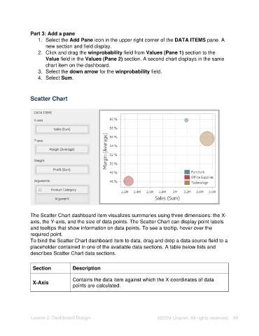
               The Scatter Chart dashboard item visualizes summaries using three dimensions: the X-
               axis, the Y-axis, and the size of data points. The Scatter Chart can display point labels
               and tooltips that show information on data points. To see a tooltip, hover over the
               required point.
               To bind the Scatter Chart dashboard item to data, drag and drop a data source field to a
               placeholder contained in one of the available data sections. A table below lists and
               describes Scatter Chart data sections.

                 Section           Description


                                   Contains the data item against which the X-coordinates of data
                 X-Axis
                                   points are calculated.


               Lesson 2: Dashboard Design                                   ©2024 Unanet. All rights reserved.  86

