Page 20 - Microsoft Word - Using Adhoc & Analytics Expressview Reports - Participant Guide (SDL).docx
P. 20
adding up the values for a data field in each group. You can also make charts to
               visualize the data in each group and compare groups to each other.

               Formulas
               Formulas can be used to create custom data columns in ExpressView. Formulas are
               calculated once per row, based on the other data values in that row. For each row
               calculation, a formula value is returned for that row, which populates a new column of
               data. You can use these columns just like any others: format the data, add to a
               visualization, or group based on formula columns. They are treated the same as data
               columns.

               Manage Data
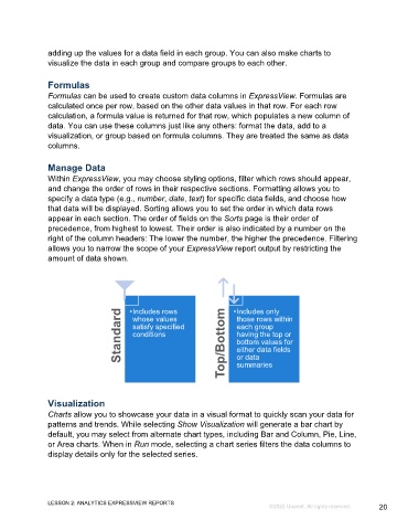
               Within ExpressView, you may choose styling options, filter which rows should appear,
               and change the order of rows in their respective sections. Formatting allows you to
               specify a data type (e.g., number, date, text) for specific data fields, and choose how
               that data will be displayed. Sorting allows you to set the order in which data rows
               appear in each section. The order of fields on the Sorts page is their order of
               precedence, from highest to lowest. Their order is also indicated by a number on the
               right of the column headers: The lower the number, the higher the precedence. Filtering
               allows you to narrow the scope of your ExpressView report output by restricting the
               amount of data shown.


                                     Standard  •Includes rows       Top/Bottom  •Includes only
                                         whose values
                                                                        those rows within
                                         satisfy specified
                                                                        each group
                                                                        having the top or
                                         conditions
                                                                        bottom values for
                                                                        either data fields
                                                                        or data
                                                                        summaries


               Visualization
               Charts allow you to showcase your data in a visual format to quickly scan your data for
               patterns and trends. While selecting Show Visualization will generate a bar chart by
               default, you may select from alternate chart types, including Bar and Column, Pie, Line,
               or Area charts. When in Run mode, selecting a chart series filters the data columns to
               display details only for the selected series.


               LESSON 2: ANALYTICS EXPRESSVIEW REPORTS
                                                                                  ©2022 Unanet. All rights reserved.   20

